Buttons
Official pasby trademark buttons for login, signup, identify, confirm, sign, and link flows.
These buttons are for external use on your website or mobile app. They give users a familiar pasby entry point for same-device identification — when the user taps a button on the same device as their pasby app, the flow can autostart after your backend creates the request.
A button is a UX affordance, not a substitute for server-side flow creation. Your backend still calls the API (or opens the link from a same-device response).
Design
Buttons ship in three themes. We recommend vermilion (brand red) or light on pale backgrounds; use dark on charcoal or navy layouts.
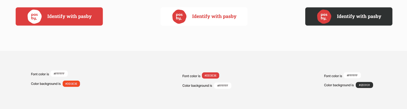
| Theme | Background | Text | Best on |
|---|---|---|---|
| Vermilion | #DD3E3E | White | Default; highest recognition |
| Light | #FFFFFF | #DD3E3E | Light pages and forms |
| Dark | #2D3131 | White | Dark mode and marketing hero sections |
Brand rules and additional assets: pasby brand portal.
Dimensions: 252 × 56 px, corner radius 8 px. Do not alter the pasby mark or proportions.
Button types
Login
Sign up
Link
Identify
Confirm
Sign
| Button | API action | Typical use |
|---|---|---|
| Login | login | Returning users |
| Sign up | signup | New account creation |
| Link | link | Link an existing pasby eID to your app |
| Identify | login / signup | Generic identification (either action) |
| Confirm | confirm | Signing — confirm step |
| Sign | sign | Document or agreement signing |
How to integrate
Static SVG (most common) — Download the asset for your button type and theme (tables below), then use it as you would any image: wrap in <button> or <a>, attach your click handler, and start the pasby flow from your backend.
<button type="button" onclick="startPasbyLogin()">
  <img src="/assets/pasby/login-vermilion.svg" alt="Login with pasby" width="252" height="56" />
</button>
Hosted web login (OIDC) — If you redirect users to pasby-hosted identification rather than same-device API flows, use LoginButton from @finsel-dgi/pasby-next. It handles routing and branded styling for App Router apps.
Custom SVG in React — The downloadable assets are plain SVG. You may inline them or render them as <img>; theme colors are fixed per file (vermilion, light, dark).
Login
| Vermilion | Light | Dark |
|---|---|---|
| login-vermilion.svg | login-light.svg | login-dark.svg |
Sign up
Use when you want distinct copy for “Sign up with pasby” vs login.
Vermilion
| Vermilion | Light | Dark |
|---|---|---|
| signup-vermilion.svg | signup-light.svg | signup-dark.svg |
Link
For linking a pasby eID to an existing account.
| Vermilion | Light | Dark |
|---|---|---|
| link-vermilion.svg | link-light.svg | link-dark.svg |
Identify
Generic “Identify with pasby” label when you do not need separate login vs signup copy.
Vermilion
| Vermilion | Light | Dark |
|---|---|---|
| identify-vermilion.svg | identify-light.svg | identify-dark.svg |
Confirm
For confirm signing flows (action: "confirm").
Vermilion
| Vermilion | Light | Dark |
|---|---|---|
| confirm-vermilion.svg | confirm-light.svg | confirm-dark.svg |
Sign
For sign actions (action: "sign") — documents and agreements.
| Vermilion | Light | Dark |
|---|---|---|
| sign-vermilion.svg | sign-light.svg | sign-dark.svg |
Logo assets
Standalone pasby logomarks (not full buttons):
| File | Use |
|---|---|
| logo.svg | Full-color mark |
| logo-light-bgk.svg | On light backgrounds |
| logo-dark-text.svg | Dark text variant |
| logo-black-bgk.svg | On dark backgrounds |
Related
- Identification guide — same-device flows
- Signing guide — confirm and sign actions
- Next.js OIDC — hosted login button
- Device patterns — when same-device applies